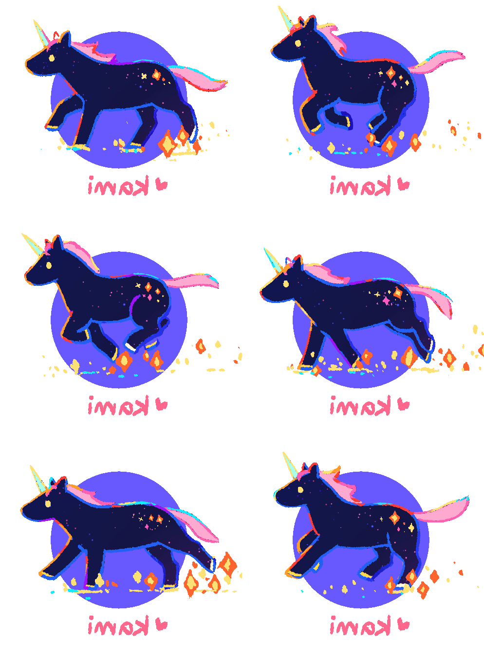
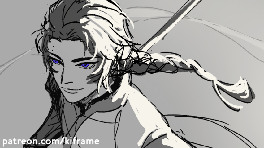
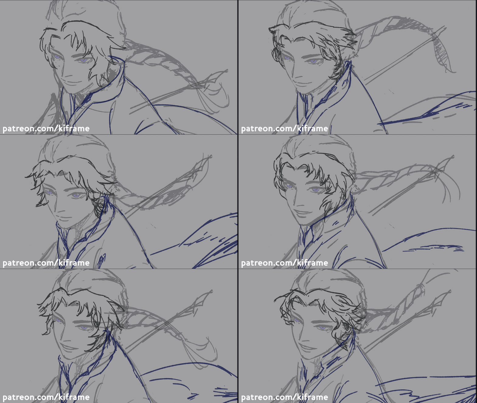
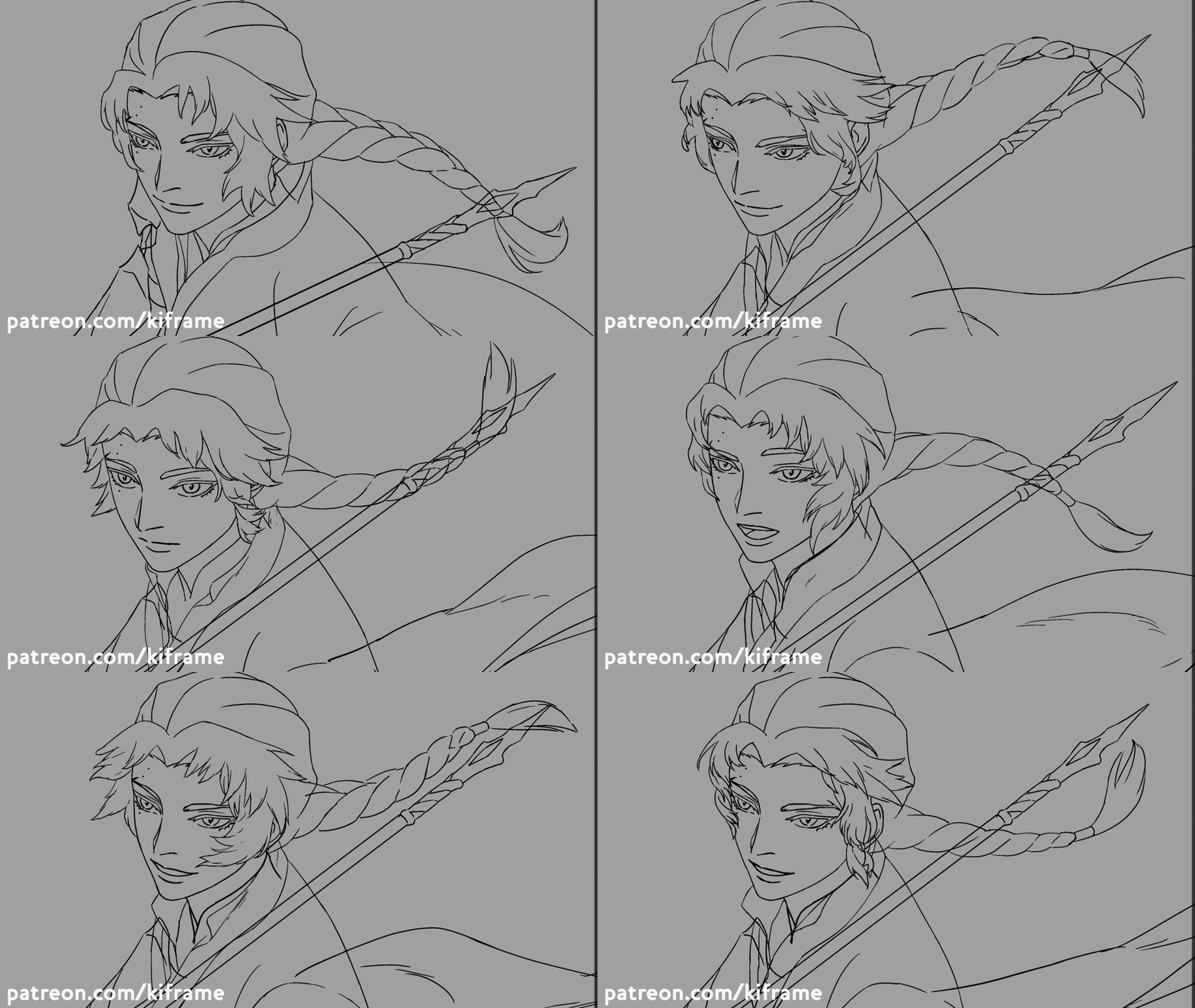
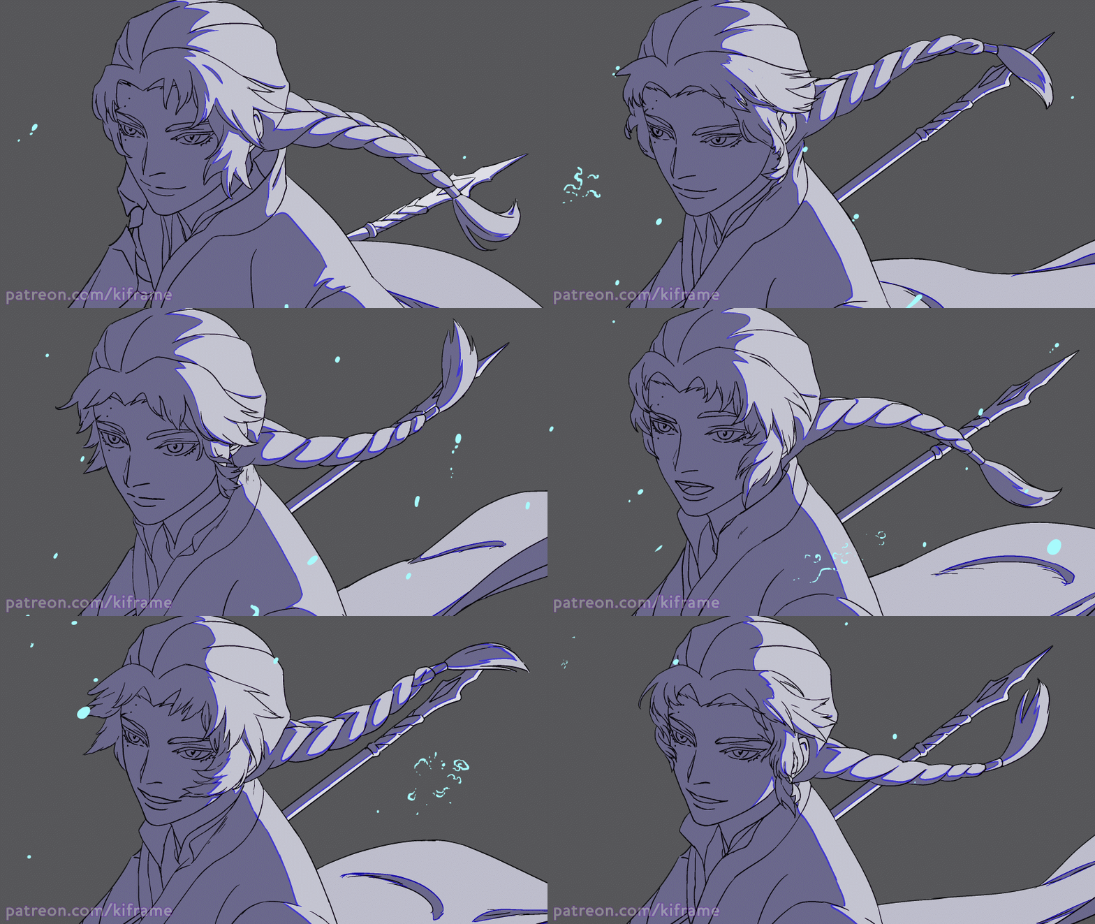
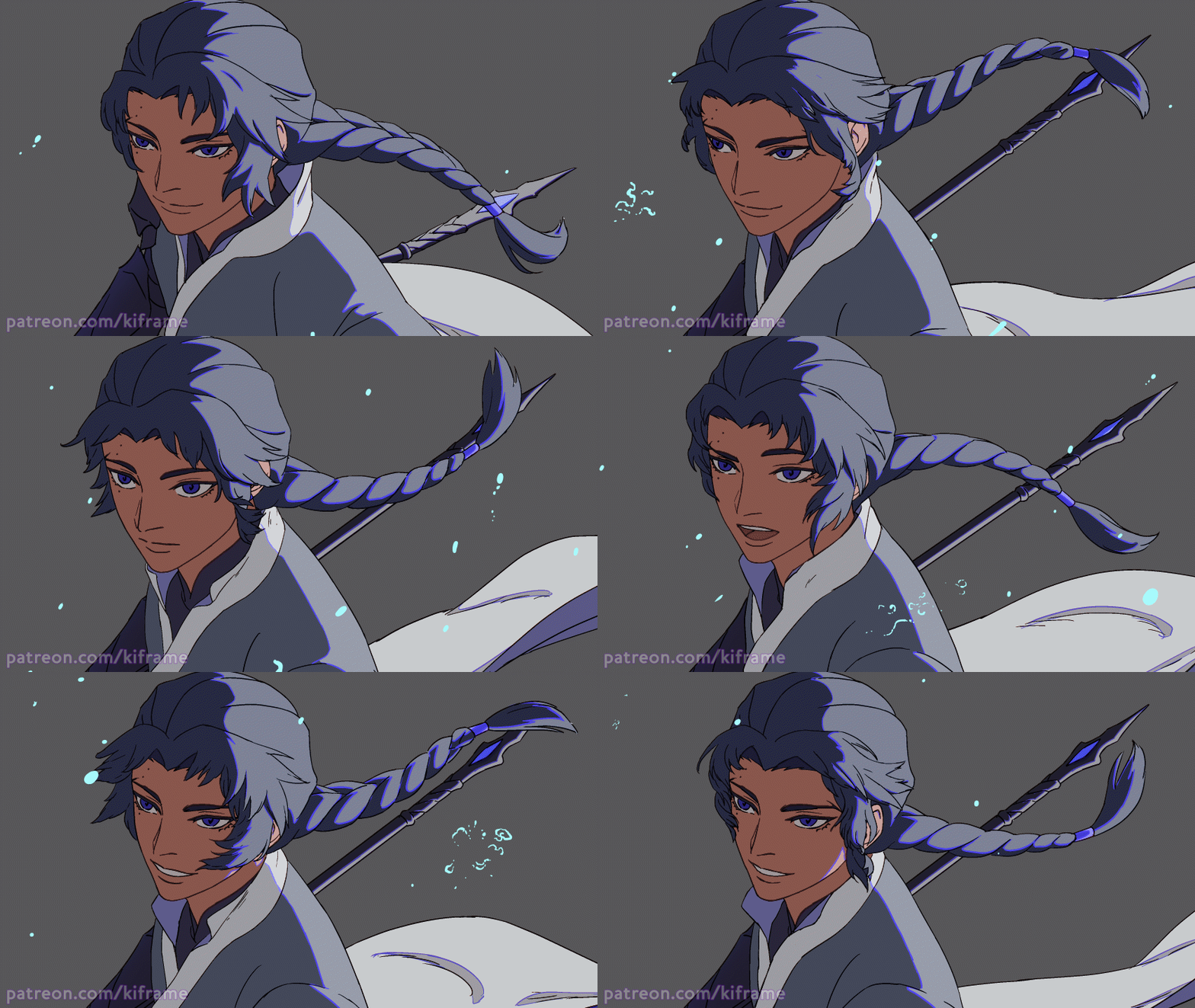
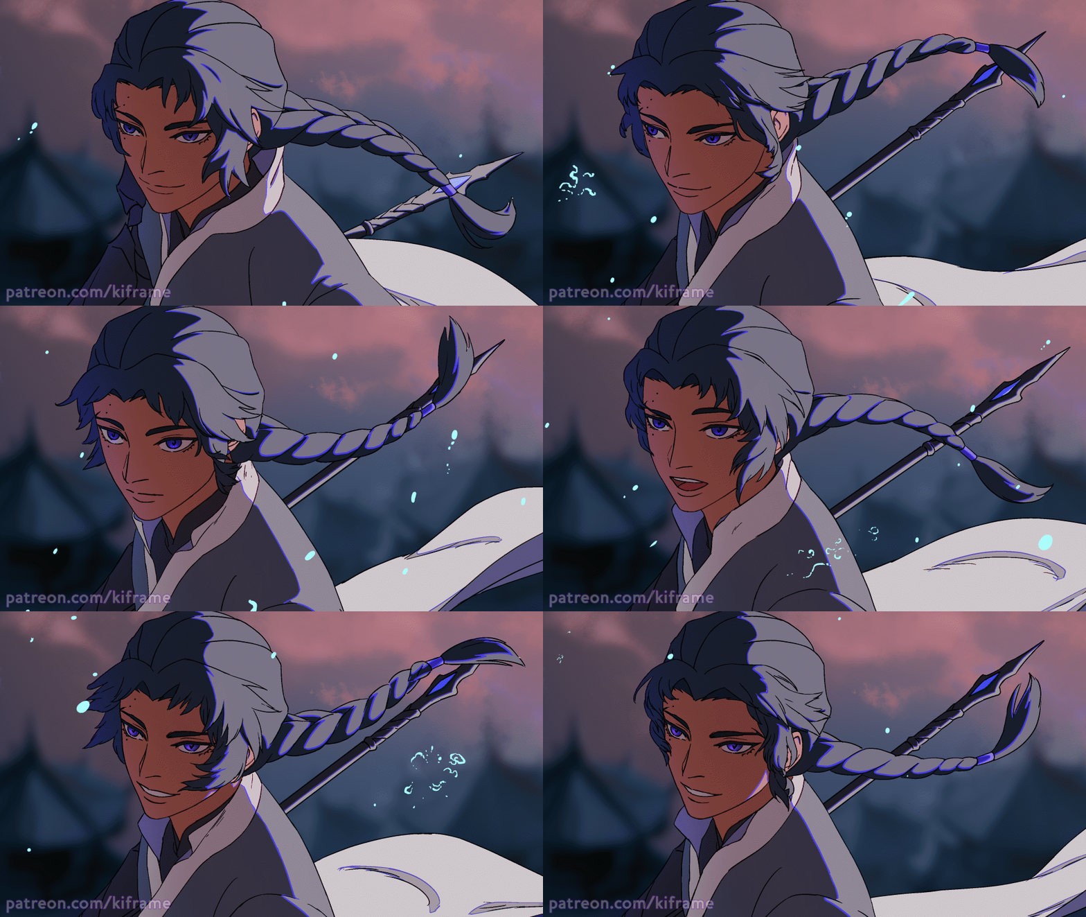
Animations for three original characters as a test for art, animation, and compositing styles and approaches for ongoing personal original projects.
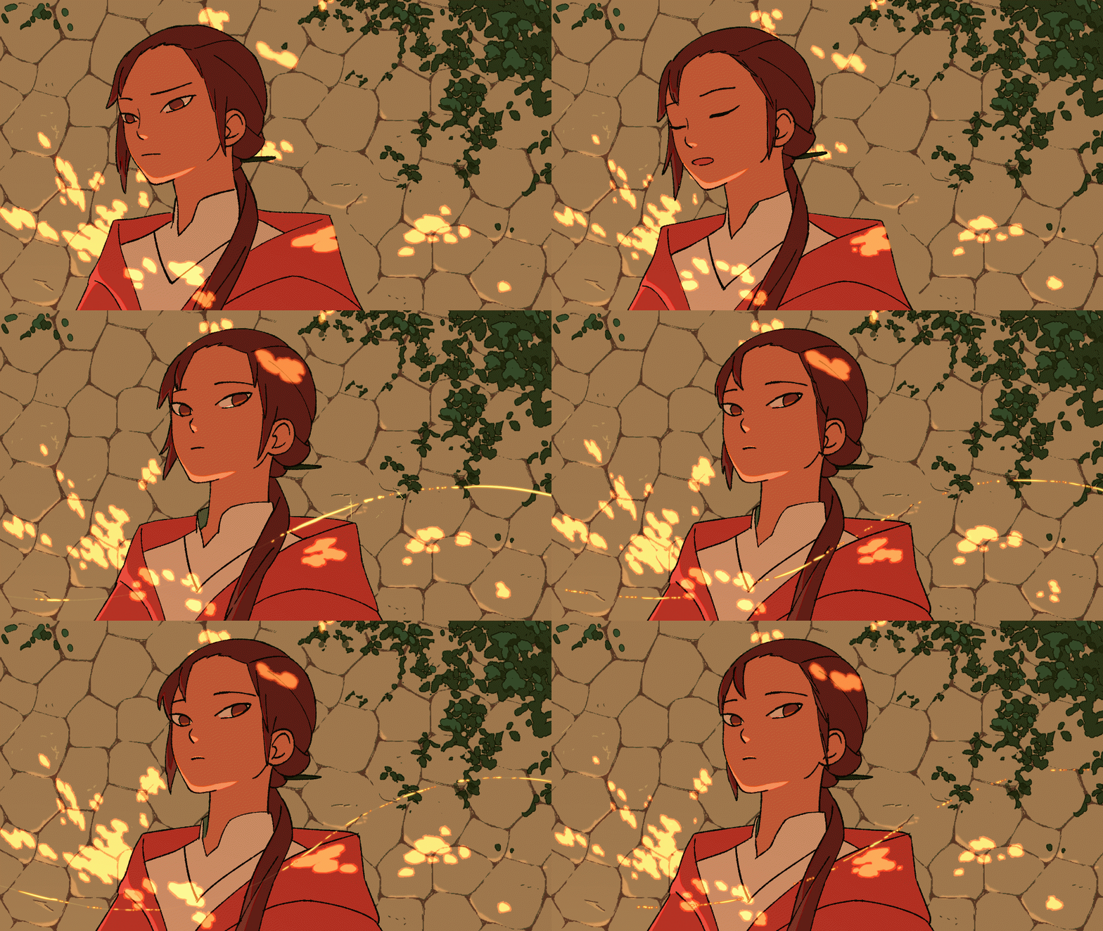
Alcea
simpler style focusing more on flats and simple lighting/shading. More economical animation in 3s and 4s for a more time-saving approach as well as to give a feeling of slowness/lethargy as part of the character’s state of being and personality in this particular scene.
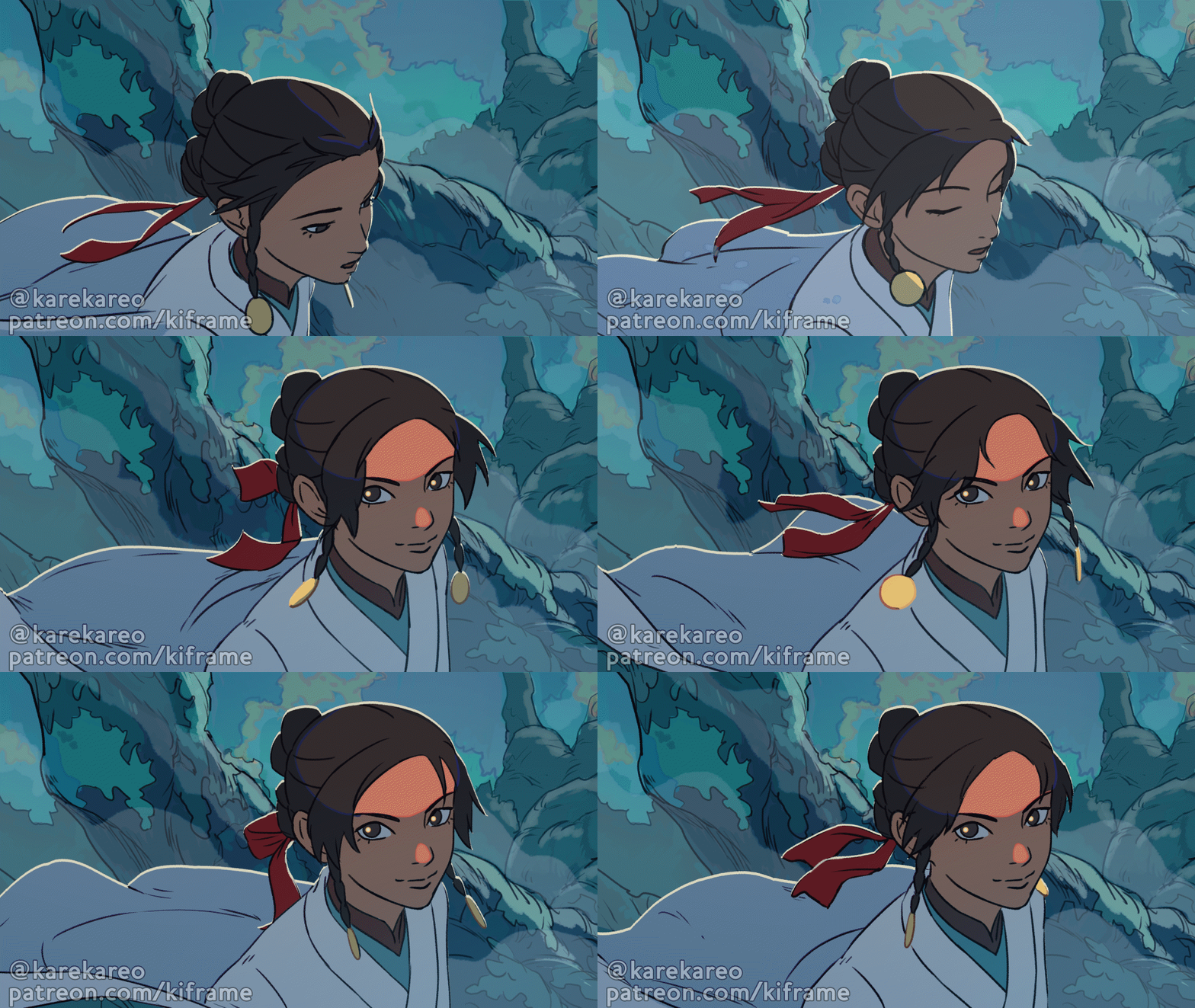
Lili
Slightly rougher and softer art with select colored lineart areas. More active animation in 2s and 3s for a higher energy scene, environment, and character.
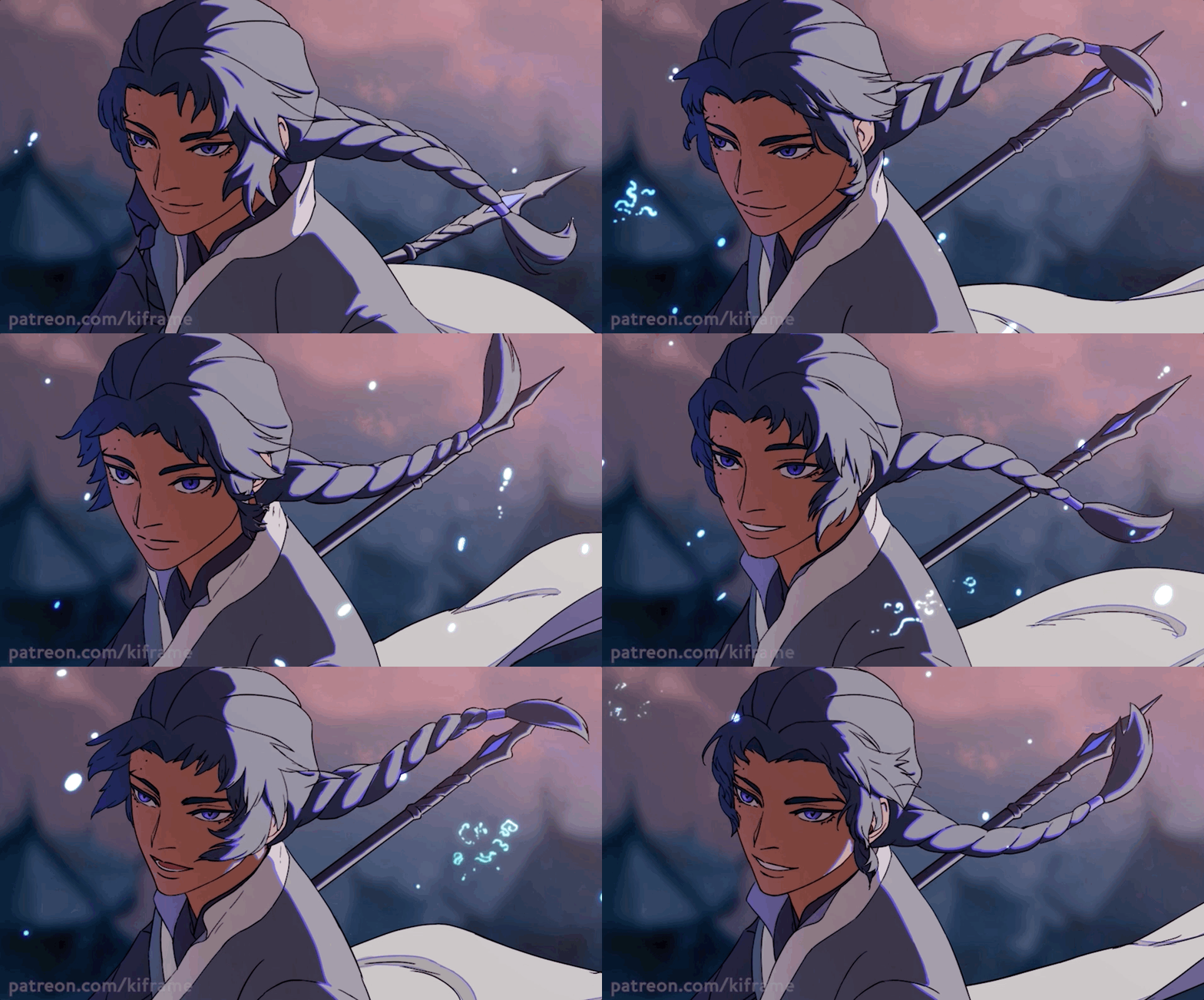
Rain
Clean lineart and coloring, with outlined lighting for a subtle midtone. Smoother animation in 2s and 3s to give a more refined style to a more complex design and character personality.
